The Armstrong design standards were envisioned to be a substantial work in comparison to the usual ambitions set for corporate design guidelines. If engineers in the organization might ignore a set of thin or pedestrian design standards, Armstrong’s design standards were to have real impact. When the standards guide was completed, it was showcased in the lobby in head office for every employee to investigate.
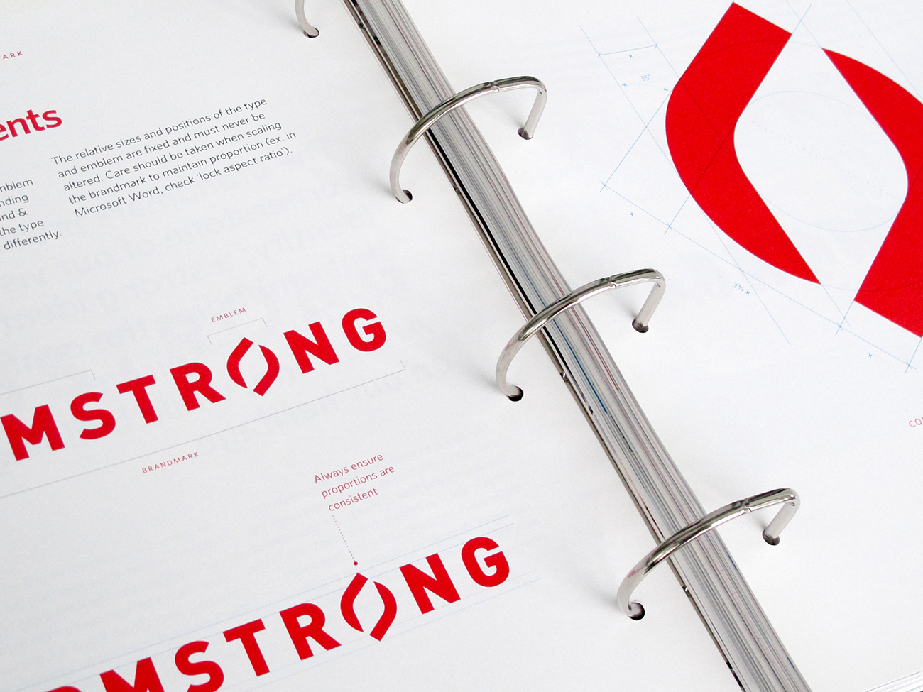
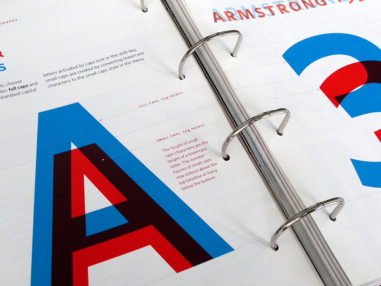
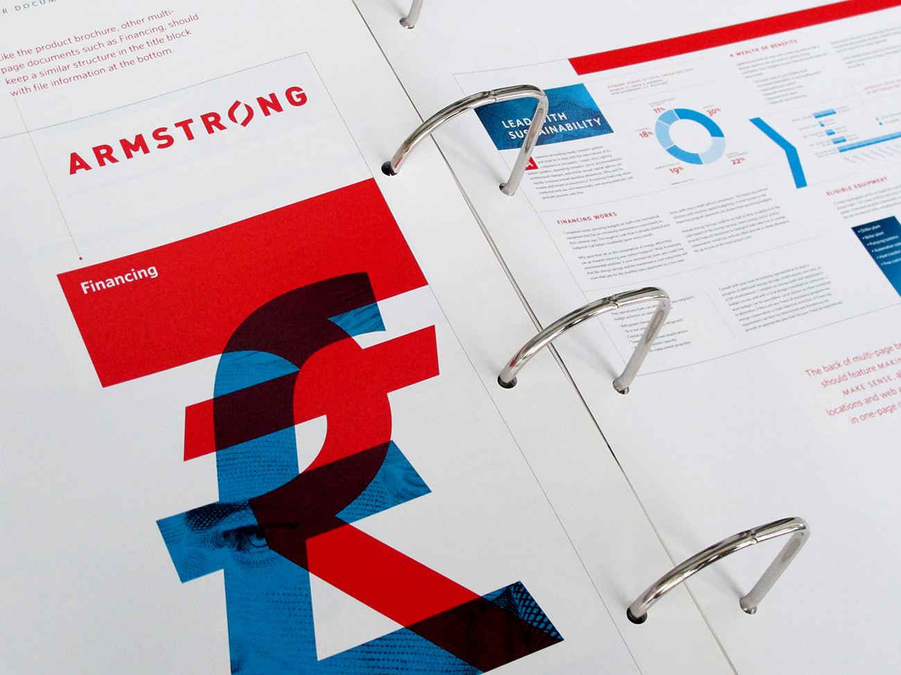
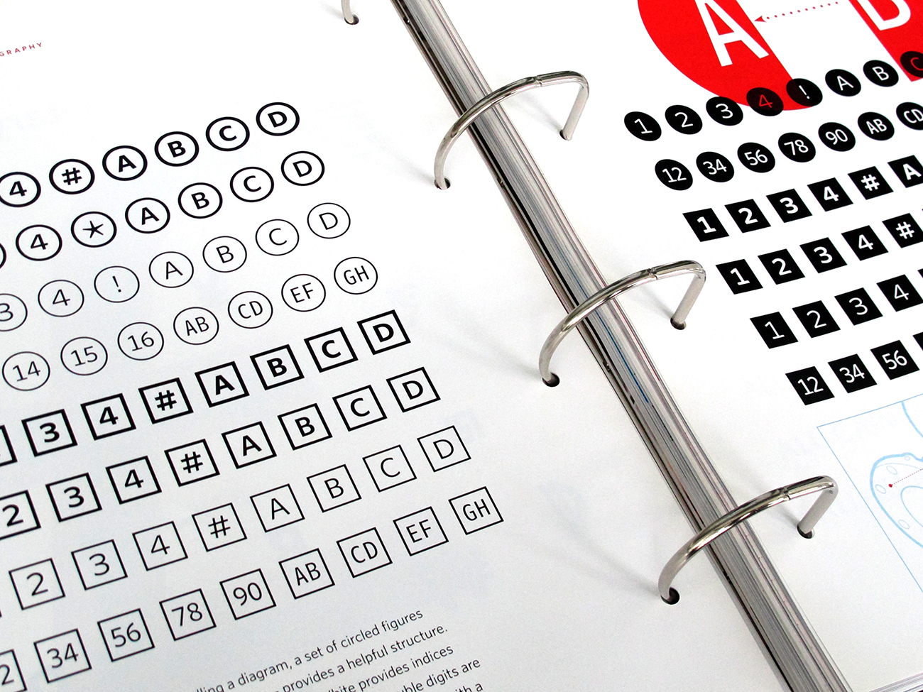
The guide was structured into core elements: brandmark, typography, colours, a proportion and grid system, photography, and illustration. Following this are templates and example designs. Navigational markers and pagination had to be developed so that loose pages can be added in the future. The binding would also have to facilitate this, so a four-ring binder was chosen, and was custom-designed with silver foil stamping. The paper and binder was selected for lower environmental impact.
The design standards brought a greater presence of the importance of design in the organization, setting a substantial baseline for future projects. Since its publication, the organization of core design elements have been combined in a variety of ways that frequently distinguishes Armstrong design from competitors in branding, industrial design, trade shows, digital and print marketing.


